
Just thought I would write a brief post about this week’s show installation before we arrive at the private view. I am commenting on the installation of my work – of course, as tools and installation team I had my virtual ‘happy to help’ cap and badge on and had put myself in a position where I could, when needed, support the other students:)
I delivered my paintings on Saturday to the very helpful Bank Street Arts and then installed myself in travelodge (home for the week). Went to see Mr Turner – great film – accompanied by a terrible premonition of my being squashed by a falling canvas – you have to watch it:)
Sunday
I was the first to arrive as couldn’t sleep and well keen to see the gallery. I had the opportunity to lay out all my work in the whole of gallery one before Jo arrived. This was really exciting as the white space allowed me to look at the work uninterrupted which my studio doesn’t allow. Then did a lot of playing around and rearranging combinations of work to see where it could fit. Logically, we both could use 2 walls of the gallery space, but the dialogue between works and the two different bodies of work obviously has a huge impact on the viewer’s encounter as they enter the building. I already had in my head a sense of which pieces I wanted to show 1.1, 1.3?, 1.6, 1,7, 1,8, but had imagined the walls to be longer and quickly realised that only 2 would be possible. I experimented with splitting the triptych around corners to create more space but as this should be considered as a one piece, I felt that it separated the elements too much.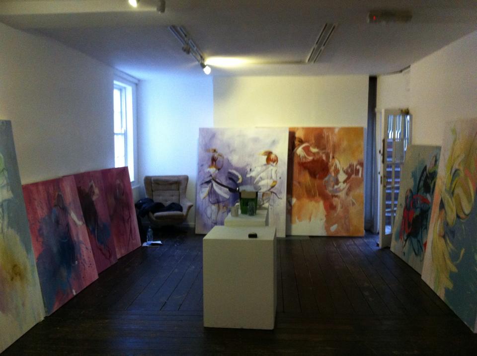 MondayI left the proposed hang propped up from Sunday so when I arrived I had the chance to reassess – it felt right and the work choices (1.1 and 1.7) although less than I would have like to have shown, complimented each other. Jo and I played around with her multiple pieces to see how they could potentially inhabit the space. There were quite a lot of things that I hadn’t yet considered for the hang which came into play at this point. The way the eye travels around the room; heights of work in relation to each other; the colour balance – not dominating and still allowing the other work to breathe; flow left to right – love the correspondence of this with reading/book; framing, apertures and divisions created by the building itself. 1.1 was reasonably easy to hang, balanced on a pile of chair, first aid box and tape measure for the desired height.TuesdayHanging the triptych proved to be a far greater challenge due to the wonkyness of my stretchers, in particular the middle panel. I had reached a delicate balance of screwing one mirror plate in with the work balanced on my knee and then leaving it dangling on a diagonal to then position with spirit level and screw in the other side. I measured gaps so the piece was equidistant from either end and the gap between each panel was equal, hanging the first, then the third panel. However, when it came to the centre piece I could establish why it looked wrong until Amelia whipped out her set square and we realised that the piece was warped – probably from multiple stretchings:/ There had been a similar problem with one of Jo’s pieces but as a triptych in quite a confined space I had very little wriggle room to disguise the problem. After much playing, I managed to create the impression of an even (ish) piece, playing on the uneven ceiling, floor and perspective trick created by moving past the work. There is also a really cool correspondence between the three internal windows into the space, the exterior windows, and the three panels with pages/series.


Wednesday
Labelling seems like such a small detail but I discovered that your gaze can be completely thrown by a wrongly placed label or sign. After some experimentation, I decided that info needed to be quite low so as not to interrupt the flow of work. This included my name which is almost hidden behind and open door, and my work labels which are situated between both works. I chose grey font for the labels to keep the display quiet, in line with the work.
Looking forward to the PV!:)
