I have just gone through Vitamin P & P2 to look for painters who use drawingness or bring gestural and tighter painting together to focus the viewer on particular parts of the image. I hope that these painters will underpin the new work I make over the coming months and by keeping them in one entry, I will be able to more easily revisit these as reference material.
http://www.saatchigallery.com/artists/phoebe_unwin.htm
 |
| Phoebe Unwin – Mixture of more focused and loose brushstrokes. Image becomes more monochrome as it moves towards the edges. |
http://www.amysillman.com/pages/index.php
 |
|
| Amy Sillman – have selected smaller scale works as the block colour compositional elements are more evident. Really like the series and simplification of shapes with figures within geometric spaces. |
http://www.saatchigallery.com/artists/makiko_kudo.htm?section_name=paint_artist
 |
| Makiko Kudo – weird downwards viewpoint and block colours, figure is absorbed by the environment. |
http://blogs.artinfo.com/berlinartbrief/2013/11/19/portrait-entering-maki-na-kamura%E2%80%99s-landscape-of-pictures/
http://voltashow.com/Maki-Na-Kamura.7225.0.html
 |
| Maki Na Kamura – oily, washy surface – some layering evident but more planes of colour. Some areas of linear drawing evident against blocks and more detailed areas. |
http://www.victoria-miro.com/artists/_19/
 |
| Chantal Joffe – I like the way the figure is cramped into the picture space. Simplifies lines and stripes in background suggest environment. |
http://www.nicodimgallery.com/artists/adrian-ghenie/
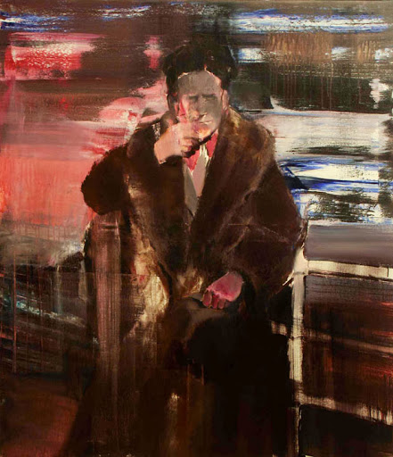 |
| Adrian Ghenie – Virtually abstract background with more detailed figure. Tight, dark colour palette sets gloom. |
http://www.maureenpaley.com/artists/kaye-donachie
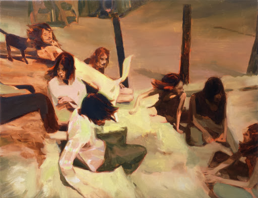 |
| Kaye Donachie – Use of diagonals and figures emerging from the ground – environment merges through use of generic colour. |
http://www.goodman-gallery.com/artists/lisabrice
 |
| Lisa Brice – Loose block painting and empty space – don’t like the green but gives suggestion of shadow |
http://www.victoria-miro.com/exhibitions/_412/
 |
| Hernan Bas – My second favourite who I seem to keep coming back to. Quite abstract gestural painting with smaller brushstrokes and sharp edges. |
http://www.saatchigallery.com/artists/luc_tuymans.htm
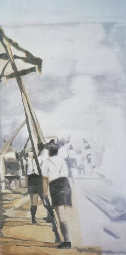 |
| Luc Tuymans – Composition very weighted to left side. Shadow figures/suggestions on right where colour is virtually reduced to monochrome. |
http://www.saatchigallery.com/artists/daniel_richter.htm
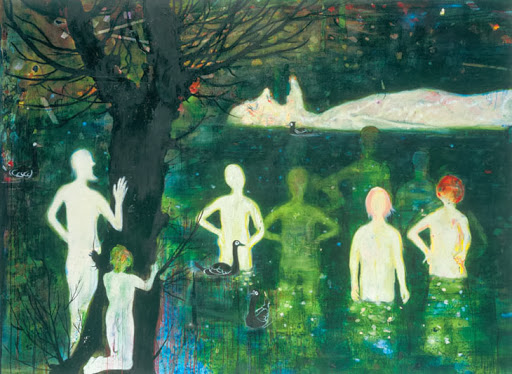 |
| Daniel Richter – Not keen on green but interesting use of negative space and phantom figures |
http://www.gagosian.com/artists/elizabeth-peyton
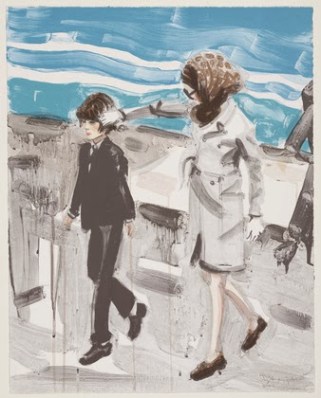 |
| Elizabeth Peyton – Very loose brushstrokes are still descriptive. Limited colour palette creates emptiness in the painting. |
http://www.greengrassi.com/Artists?aid=16
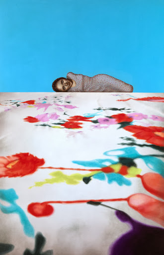 |
| Margherita Mazelli – Distance from figure, angle of gaze and viewer. Use of block colour background against much more detailed figure and foreground. |
http://www.saatchigallery.com/artists/cecily_brown.htm
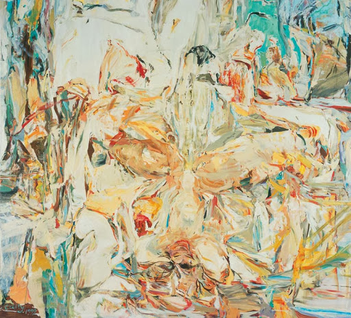 |
|
| Cecily Brown – Abstract brushstrokes are suggestive. Process compliments hidden and engaging the gaze of the viewer. |
http://www.magdalenalamri.com/
 |
| Magdalena Lamri – Love unfinished abstract edges and evidence of linen (?) coming through. Some depth, some dribbles, some unfilled drawing lines:) |
 |
| Annabel Emson – painting becomes looser towards edges, colour is also more concentrated in central section which draws the eye in |
Reflection
Some things I have noticed whilst collecting these images…
- I have changed the colour palette I am attracted to – lots of red, blue and white
- I am looking at more blocky paintings – thick and thin – there is less interaction between the colours in a physical way. Flat planes of colour suggest rather than describe the environment.
- Elements of unfinished and negative space
- Use of same colour on figures and background to absorb or merge elements
- Diagonals in composition
- Areas of abstraction – larger brushes (background)
- Elements of monochrome – white and payne’s grey particularly in drawing areas
- Shadow figures
- Brushstrokes to obscure or suggest


Good taste! Well… At least it’s very similar to mine 😉