Great tutorial with Stewart – don’t usually publish my tutorial notes but so much info here it seems sensible to link it through.
· Stewart and I discussed the intentional menace in my work. He asked if my work is autobiographical (it isn’t deliberately so). He was interested in the degenerative play between siblings which can quickly turn into punching, pinching and poking. We talked about whether the expressions were a grimace or a grin, the slight imbalance, stretching of the composition. Stewart felt that the work showed something on the edge/cusp.
· He suggested that I look at David Lynch’s Eraserhead film – holding a smile for 5 minutes – something becomes something else.
· Artist recommendations – Brian Calvin p.70 Vitamin P2 – eyes for mood, slightly vacant. Formal properties – flattening of colour. Stewart observed that I had twisted the landscape space but had not begun to twist/abstract the figure yet – this is a possible area for exploration. Calvin doesn’t use photos as reference and uses saturated colour.
· Chantal Joffe p. 152 Vitamin P2 – uses tone and photographic references. The figures are bleached out like a flash photo. Sunken eyes, drama from the light to dark contrast. She simplifies backgrounds, reducing them to shapes. Stewart recommended that I get rid of some of the clutter in the background of my paintings to create contrast between busier and empty areas (links well to what I have started in regard to positive and negative space). I could tilt and twist the pictorial space and experiment with a limited palette. http://www.victoria-miro.com/artists/_19/
· Formally, I need to reconcile the disparate areas in the paint surface – use visual language devices. Look at Chantal Joffe’s work – minimalised tonal spaces – the figures read as real.
· Pastoral landscape is a feature – child’s play and menace. How can I articulate a pastoral landscape? Stewart thinks the intimacy of the daily works well as the viewer can more easily relate. The water element – liquidness, insecurity, swamp-like, Manet, reflection, moving and changing. I need to research and photograph water – magical moss covering – shorelines?

· We discussed the practical painting elements – think about working on a white palette – this can affect other colours applied to the canvas. Painting tools (brushes, rags etc) should fit the character of the painting. Try leaving painting to dry on a flat surface. Alien elements – bristles etc. – could be interesting. Leave busier and emptier patches. The concept/idea should be reflected in the choice of materials and vice versa. Explore blocks of colour. Consider the size of the work – large scale there is a physical encounter, monumentality but this can also be created on a tiny scale – the viewer is required to enter the space with the imagination. Size needs to be chosen critically. I need to develop my criticality further in line with my intentions. Try tiny and massive work. Explore variations on a theme.
· Stewart suggested that I watch Youtube slideshow of Matisse’s pink nude changing and evolving. Investigate Frank Auerbach’s reworking of the paint surface to keep freshness in the work. I’m interested in the idea of residue, the trace of what the painting was – partial erasing. We discussed the piece with the negative space – if there is a consensus of opinion, generally it is meaningful so it is worth preserving the work in its seen state. The negative space may seve to disembody the figure in some way – link to Joffe spectral.
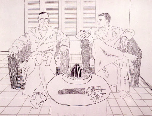
· Consider 2 figures, the angle and placing. There is too much in the background of the images – I need to leave some stuff out. The collaging elements are declared by the painting – this works to add imbalance/unease. Poke and pinch comes up again – good phrase! Pairs of figures in painting are quite rare – more common in photography – why is this? I am going to explore reducing crowd scenes to two figure compositions. Also, I will review Neel and Hockney – both produce double portraits – analysis of pairs, reflection. Is there something in this for my proposal? The rarity of pairs… Stewart reminded me of the painting (Renaissance?) with the two babies (one red one white)

· Do objects have to be their naturalistic colour? I hate green but it is everywhere. Stewart suggested I explore less naturalistic colours and their connotations – link to Picasso red/blue periods for mood.
One Month Reflection
My tutorial with Stewart was absolutely fundamental in the moves I have made in my practice since. The most significant thing was that I made a decision about the direction of my final project proposal. He also made me commit to trying out some ideas – large scale, block colour, un-naturalistic colour – straight away which I had been holding off from due to some confusion about the previous unit’s feedback. I have banished most elements of green from my work and have started to use primaries and some brighter shades e.g. crimson lake to move away from overly pastoral looking environments while still indicating landscape through the use of shape and lines in the background. I have found it really difficult to reduce down the layers of colour in my work but breaking this method of making for the time being has helped me to think more about the composition. I am also exploring different levels of ‘finish’ and emptier areas of space to help focus the viewer and create areas of looser and more static drawing and brushstrokes.